
The perception science that explains how your learner sees their board
Before your learner can learn what any button means, their brain has to solve a more basic problem — one so fundamental we rarely think about it. They have to look at a flat surface covered with circular objects and perceive it as a collection of separate, pressable things.
Each one distinct from the others and from the surface underneath.
This sounds trivial. It isn't. The raw visual data entering your learner's eyes is just a wash of light, shadow, color, and edges. Turning that into "this is a button, and that is a different button" requires sophisticated neural processing that scientists have been studying for over a century — and the principles they've discovered explain a lot about why certain soundboard designs work and others don't.
Figure and Ground: The Brain's First Job
Every visual scene gets divided, instantly and automatically, into two categories: figure (the object of focus, perceived as having definite shape and appearing "in front") and ground (the background, perceived as shapeless and extending behind). This happens before conscious thought. It's not a decision. It's a reflex.
Danish psychologist Edgar Rubin formalized this principle in his 1915 doctoral thesis.
Using what became one of psychology's most famous images: the Rubin vase. You see either a white vase or two dark face profiles — never both simultaneously. The image hasn't changed. Your brain's figure-ground assignment has.
What determines which element becomes "figure"? Research in perceptual psychology has identified several factors: smaller regions tend to be seen as figure. Enclosed regions win over surrounding ones. Higher-contrast elements pop forward. Convex shapes dominate concave ones. And critically, elements in the lower portion of a visual field are more likely to be perceived as figure — which matters when your learner is looking down at a soundboard on the floor.
Every button on a soundboard must register as "figure" against the tile "ground." This happens most reliably when buttons are physically raised above the tile surface, when they differ in color or texture from the tile, and when shadows or depth cues reinforce the separation. A flat sticker on a flat surface? The brain may not parse that as a separate object at all. A raised, rounded button seated in a recessed tile? Figure-ground separation is immediate and effortless.
The Laws of Grouping: How Buttons Become Organized
Once individual buttons are perceived, the brain's next task is organizing them.
This is where the Gestalt psychologists come in — a group of German researchers whose work, beginning in the early twentieth century, revealed that perception isn't just a collection of parts. The brain spontaneously organizes elements into structured wholes.
Max Wertheimer's foundational 1923 paper described several laws of perceptual grouping, all of which operate on a soundboard:
Proximity: Elements close together are perceived as belonging together. Buttons on the same HexTile are automatically grouped in the learner's perception, while buttons on different tiles feel like separate clusters — even if the physical distance is small. This is why keeping related words (food words, activity words) on the same tile helps learners build spatial categories.
Similarity: Elements that share visual characteristics — color, shape, size — are grouped. If all food-related buttons are one color and all activity buttons are another, the learner's brain groups them before any learning occurs. The perceptual system does organizational work for free.
Continuity: Elements arranged along a line or curve are perceived as related. A row of buttons feels like a sequence. A cluster feels like a group.
Common region: Elements enclosed within the same boundary are grouped. Each HexTile functions as a boundary, creating perceptual "containers" for the buttons it holds.
These principles have been confirmed across species , including in pigeons, fish, and primates. While direct Gestalt research on dogs and cats is limited, the underlying neural mechanisms of perceptual organization are highly conserved across mammals. Your learner's brain is grouping buttons before it understands what any of them do.
Just-Noticeable Differences: How Much Contrast Is Enough?
Here's where the science gets very practical.
In 1834, German physiologist Ernst Heinrich Weber published De Tactu, describing experiments where blindfolded subjects compared weights. He discovered something profound: the smallest difference a person can detect between two stimuli — the just-noticeable difference, or JND — isn't a fixed amount. It's a proportion of the original stimulus.
If you're holding a 100-gram weight, you can notice the addition of about 2 grams. But if you're holding a 1,000-gram weight, you need about 20 grams of change to notice anything different. The ratio stays constant even as the absolute amounts change. Gustav Fechner formalized this mathematically in 1860 as Weber's Law: ΔI/I = k.
For button design, Weber's Law means that contrast between buttons must exceed the learner's JND threshold to be perceived as distinct. Two buttons that are slightly different shades of the same color may fall below threshold — the brain literally cannot tell them apart. Two buttons in clearly different color families (blue versus yellow, for instance) are far above threshold and effortlessly distinguishable.
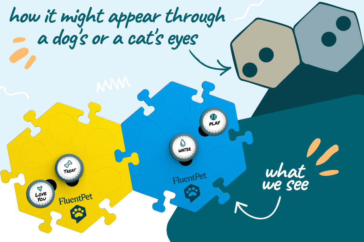
This is where the biology of animal vision becomes directly relevant. Dogs have: dichromatic color vision — two types of cone photoreceptors compared to our three — which means they see the world primarily in blues and yellows. Reds and greens blur together into brownish-gray. Cats have a similar dichromatic palette. A red button and a green button that look completely different to you may be nearly identical to your learner. But a blue button and a yellow button? That contrast is vivid for both dogs and cats.
Interestingly, a 2013 study by Kasparson, Badridze, and Maximov found that dogs actually prefer to use color over brightness when discriminating between stimuli — overturning the assumption that color doesn't matter much for dichromatic animals. Their limited color palette is quite meaningful to them.
What About Acuity?
Color isn't the only visual factor. Your learner's spatial resolution matters too.
Dogs have visual acuity of approximately 20/75 — meaning they see from 20 feet what a human with normal vision sees from 75 feet. Cats are in a similar range, roughly 20/100 to 20/200. Neither species can read the text labels on buttons (not that they would — they can't read). But they can perceive shape, location, and color contrast at the distances involved in soundboard use (typically 1–6 feet).
What dogs and cats excel at is motion detection. Both species have higher flicker-fusion rates than humans, meaning they're more sensitive to rapid movements and changes. Dogs also have a wider visual field (approximately 240° versus our 180°), though with less binocular overlap.
This means buttons that provide motion feedback — lighting up when pressed, or physically moving under a paw — may be more perceptually salient to your learner than static indicators. And because both species see well in dim light (cats have six to eight times better night vision than humans), soundboards remain usable during the dawn and dusk hours when many learners are most active.
Putting It Together
Your learner's perceptual system is doing remarkable work every time they approach the soundboard. Figure-ground processing separates individual buttons from tiles. Gestalt grouping organizes buttons into spatial clusters. Weber's Law determines whether color and contrast differences are above threshold. And the specific characteristics of canine and feline vision — dichromatic color, moderate acuity, excellent motion detection — shape what's salient and what's invisible.
None of this is "learning" in the way we usually think about it. It's the perceptual infrastructure that makes learning possible. Get the perception right — distinct buttons, meaningful color contrasts, organized spatial layout — and you've cleared the path for everything that follows.
References
Rubin, E. (1915). Synsoplevede Figurer. Overview
Wertheimer, M. (1923). Laws of organization in perceptual forms. Overview
Weber, E.H. (1834). De Tactu. Explanation
Fechner, G. (1860). Elemente der Psychophysik. Overview
Kasparson, A.A., Badridze, J., & Maximov, V.V. (2013). Colour cues proved to be more informative for dogs than brightness. Proceedings of the Royal Society B. PMC
Neitz, J., Geist, T., & Jacobs, G.H. (1989). Color vision in the dog. Visual Neuroscience. Related: PMC5717654
Miller, P.E. & Murphy, C.J. (1995). Vision in dogs. JAVMA. -e



Leave a comment
This site is protected by hCaptcha and the hCaptcha Privacy Policy and Terms of Service apply.